
Apple Wallet - Payment Usability Analysis
New Feature Development and A/B Testing
In this project, I was tasked to design a Crypto Payment feature for an e-wallet app. I chose Apple Wallet as a subject and conducted usability testing to evaluate successful feature incorporation (without losing Apple Wallet's great user experience) and the optimal amount of information on UI.
Team
Me
Key Skills
User Research / Analysis
Interaction Design
Prototype
Usability Testing
Duration
3 weeks
Summer"22
Tools
Figma
Protopie
Research
UI analysis with situation awareness in mind
To get started, I analyzed 5 different payment apps, which were "Apple Wallet, Google Pay, Alipay International, Venmo and Paypal" to study how payment apps are designed and to familiarize myself with this domain.
Situation awareness
User’s ability to perceive and comprehend critical information on UI, understand its context, and predict potential outcomes.
Key metrics
Specific metrics I used (on a scale of 1-5) among situation awareness for this analysis included "working memory, data visualization, visual hierarchy, and mental model".

Key insights:
-
Apple Wallet: Much less elements, no bottom navigation, shows cards upfront.
-
Even though they are the same e-wallets, there are significant differences in their directions, and these differences influence the variations in their designs.
Design / User Testing
Test & Insights
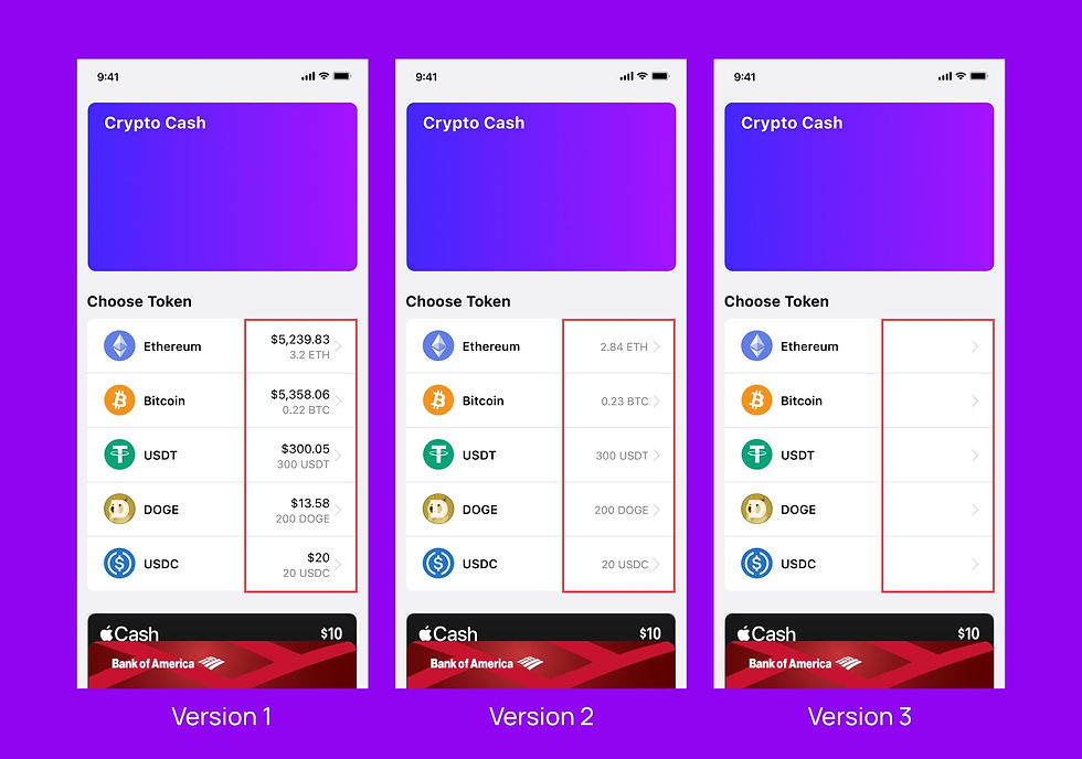
Version 1
User Task: Buy an Iced Grande Cafe Latte for $3.65 using 'Face Recognition & Bitcoin'. Then, check the remaining balance in US$ and Bitcoin.


Key insights:
-
Half of the participants kept tapping the screen after the transaction although the remaining balance was shown.
--- This was from lack of knowledge about crypto currency. They had no idea the numbers on screen represented the value of each token.
Version 3
User Task: Buy a folder for $5.25 using 'Face Recognition & DOGE'. Then, check the remaining balance in US$ and DOGE.


Key insights:
-
Surprisingly, this wasn’t the most time-consuming one.
--- This was because showing no numbers on "Choose Token Page" naturally motivated them to tap the screen.
Other projects


Quantitative results:

Qualitative results:
One thing that stood out was labeling Issues:
-
"I spent quite long figuring out what each number means because there are a lot of numbers I see."
-
"Since it's money, it's scary not to know which number stands for what."
--- I found out that labeling reduces cognitive load and their financial anxiety.
Overall feedback
Positive
-
"New experience, but it wasn't too hard to understand."
-
"It's similar to using Apple Pay."
Concern
-
"Am I paying when the rate is good?"
Each token's value changes over time, so people are worried if they pay at the right moment.
Results / Conclusion

Version 1 worked the best!
Based on the test results and the financial concern, I concluded that Version 1 was the best among the 3 versions. It received the most positive feedback from the participants as well.

Conclusion / Design change
Through this testing, I came to conclusion that showing rates instead of token values works the best considering that the rates change constantly. Also, this approach reduces the cognitive load and mitigates the financial concern.
Design of usability testing
I chose to design this new feature for Apple Wallet due to its payment-focused simplicity, in contrast to other feature-rich platforms. Leveraging Apple's minimalistic approach, I explored how varying information levels impacted the payment experience.
Testing metrics:
Quantitative
Task completion time & error rates
Qualitative
-
"How was the user experience?"
-
"What do you think about this new feature?"
Task load index (TLX)
Assessed the impact of UI density on four specific metrics(on a scale of 1-5): "Mental, Performance, Effort, and Frustration."
Design used in the tests:
Version 2
User Task: Buy a sandwich for $4.50 using 'Face Recognition & Ethereum'. Then, check the remaining balance in US$ and Ethereum.


Key insights:
-
The participants were most confused with this Version 2. Just like Version 1, this was because of lack of knowledge about crypto currency and the numbers without any labels.